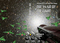
The artwork for the covers of the current editions is all licensed from professional artist Tithi Luadthong. For the first editions of the books, this was not the case....
Finding artists for the books was not as difficult as one might think. For one thing, both Mike and David had experience working with oils and acrylics, and David had done pen and ink work. Jon was very skilled in producing computer artwork. In addition, we knew several artists in various media who were willing to do some work for us, and a couple of fans also volunteered their skills with computer generated imagery.
The Starman Team preferred what we called “full wrap” dust jackets, meaning that the cover illustration wrapped all the way around the book from front to back. The images were also designed to be used in the casewrap editions in which only the front cover is illustrated.
Altogether, in addition to the Starman Team, we were assisted by David’s father and son, Bill and Nick Baumann; Baron Mrkva, Creative Director at Patriot Video Productions in Fullerton, California; Kevin Anetsberger, a fan of the Starman series; Mark Montgomery, a long-time friend of David; and Josh Kenfield and Allison Oh, both of whom were members of David’s church.
The Starman Series Logo
The logo was another brilliant idea from Mike! We loved the idea and used it, and this logo can now be found on the spine of the Starman books. It really captures the spirit of the series, and at the same time hints at the symbolism placed in the books.
Date: Around August 11, 1999: As far as the logo or emblem for the series......I like the idea David had about the spaceship in a starfield......but may I suggest that one of the stars be brighter and stylized with four diminishing rays coming off of it.....with just a hint of extra length in the bottom ray............I’m sure you see the subtle effect. Its there for anyone who wants to see it....but it is not overt....a metaphor for the series.
 |
| Bill Baumann's original painting of the Starman logo. |
Assault on Mars / Mutiny on Mars
Bill painted the cover and drew the internal illustrations for Assault On Mars. When it was rewritten and reissued as Mutiny On Mars, Mike painted a new cover for it.
This is a scan of the first painting, rendered by Bill Baumann, for the first book, Assault on Mars, early in its development. Note the air tanks (instead of NPACs) on the back of the Starmen!
Here is a cover scan of the author’s copy of Assault on Mars. Only three of these were made, one for each of the Starman Team, and each of them was personalized with the owner’s name printed inside the book. Similar editions were prepared for the Starman Team for the next two books as well. Each of these was handmade.
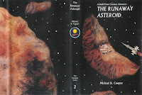
The Runaway Asteroid
Nick Baumann (David's son) painted the cover and drew the single internal illustration for The Runaway Asteroid.
Jon’s 3D mockup of the cover art for The Runaway Asteroid.
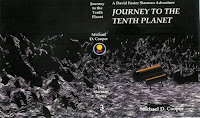
Journey to the Tenth Planet
Mike painted the cover and drew the single internal illustration for Journey to the Tenth Planet. Baron boosted Mike’s painting into the master print for the cover.
This is a 3D Bryce mockup Jon did when we were trying to decide whether to use a space scene or a planet scene for the cover of Journey to the Tenth Planet.
Jon designed and produced an alternate cover for Journey to the Tenth Planet. I really like it, but it will not replace the one that Mike painted.
Descent Into Europa
Kevin did the cover and he and Mike did the internal illustrations for Descent Into Europa.
Jon’s original 3D rendering for Descent Into Europa.
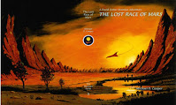
The Lost Race of Mars
Bill painted the cover and David drew the internal illustrations for The Lost Race of Mars.
Doomsday Horizon
David painted the cover and drew the internal illustrations for Doomsday Horizon.
The Heart of Danger
Mark painted the cover and Josh did the internal illustrations for The Heart of Danger.
The Last Command
Bill painted the cover and Josh did the internal illustrations for The Last Command.
The Lost Tomorrow/Paradox Lost
David drew the internal illustrations for Paradox Lost; since it was not issued as a separate novel, it never had a cover illustration.
Master of Shadows
The illustrator for Master of Shadows was Allison Oh, a member of David’s church. She produced all the illustrations using a computer. David provided her with the relevant texts from the story, a description of what he was looking for in the illustration, and photographs of individuals. Three real people, also members of his church, were the models. Here is the information David provided to Allison, along with the result of her labors.
The illustration will be used for the front, spine, and back of the book, which I hope the sketch makes clear.
Someone else will add the lettering and spine logo, so you just need to do the painting.
Note that although the photograph shows a day scene, in the book it is actually sunset with many, many stars above that are reflected in the liquid below, and there are two suns setting whose locations I have marked on the sketch. I’ve also attached a photograph marked “Center of the Galaxy”, which is a rough idea of what the stars look like from where this planet is located. And there are three photographs of Ashley. You can reverse the view so that she is actually looking left if you want, which might be better. She should be looking out over the lake but if possible I wanted to get her face in the photo.
The ratio of the overall dimensions is about 7 by 11, with the image of Ashley on the right half and the scenery extending over the rest of the image, as the sketch shows. Please don’t feel too constrained by what I’m sending you. I want you to feel free to use your artistic license.
Other Covers
For fun, Jon also produced a number of covers which were not considered for use on the first editions since we already had artwork for them. However, for the reissue of the Starman saga through Cafepress and later through Lulu, we drew upon his previous work and some new work to create entirely new covers.
Here is a draft cover that Jon created when we were working on the short story, “The Caves of Mercury”. It shows the scene when the first Starman, Ezra Hill, was preparing to land on the first planet.
The Starman Archives
There is more to writing a book than just sitting down and writing it: plots have to be designed, outlines have to be written, plot points have to be adjusted, characters have to be developed, the book's universe has to be constructed, and so forth. It's quite a process: in fact, during the first 5 years of writing the Starman Series the authors writing the series exchanged well over 7000 e-mails and generated thousands of pages of documents. Of the planned five volumes, only the first three volumes were actually produced.
The Omnibus Editions
The Cafepress editions.
The Lulu editions.
The text of the Lulu edition was updated from the first editions, correcting a number of minor scientific and typographical errors and making all terminology current with recent discoveries and decisions made by astronomical societies throughout the world. These editions collected everything written about the Starman series up to 2016, including all the novels, short stories, and the contents of the Archives.
The Endpapers
While writing the first book, David was introduced by a friend to an amateur astronomer named Tom Narwid. David spent an entire evening at Tom’s house in the desert of northern Arizona, looking through his telescope and discussing the stars with him. Tom volunteered to take a photograph through his telescope for our use, which he later provided. It was comprised of several thousand distinct colors, but Jon reduced that number to two and turned it into the first version of the endpapers for the Starman books.
The galactic photo Tom Narwid provided.
Tom’s photo, converted to two-colors for use as endpapers. This image was used in the first editions of Starman books 2, 3 and 4.
Starman fan Kevin Anetsberger, who was to create artwork for several Starman books and short stories, offered to provide a “cross-eye stereogram” for our endpapers. When we asked for an explanation, he said that a cross-eye stereogram presents two nearly identical photographs side by-side. The viewer crosses his eyes while looking at a space between the two likenesses until a third image appears between them. This image will be three dimensional.
Kevin sent us an example in midsummer 2001. In his own words, “This is called a cross-eyed stereogram. Basically, you look at the image and cross your eyes until you see a single image in the center. Give your eyes a few seconds to focus and voila!” Here is the image he sent us.
Kevin’s "Mars" stereogram, sent later.
Of course we accepted Kevin’s offer, and he produced the following.
Jon noted, “We weren’t able to use this idea in Descent Into Europa, but we did use it for the endpapers of the first edition of The Lost Race of Mars. The funny thing is that not a single one of our readers has been able to get the stereogram to work! David, Mike, and I (as well as Kevin, the artist) can make it work just fine, but we seem to be the only ones who can. The good thing is that the endpapers for that book are still nice, even if you can’t make the stereogram to work – that’s one of their big advantages over the ‘Magic Eye’-type 3D images.”


